The stories behind the sites we build...

We are proud to present the designs and stories behind some of the website we've designed for our clients ...

Dec '11 Case Study: Website Design for La France Café & Crêpes

The Story Behind the Site


La France Cafe's new website - to be released in Jan 2012

Do you love French cuisine?

Then you will love looking at the crepes on this website! And they taste as good as they look!

Fabulous Fun

Designing this website was fabulously fun because of the friendly and flamboyant French Chef at La France Cafe and Crepes Restaurant, Chef Benjamin Mchabcheb. His love of good food, family and friends was a joy to capture.You just can't go there without some of his enthusiasm rubbing off on you.

The Design Objective

The main design objective for this site is to draw people into the restaurant. But how? After some long and hard market research that involved sampling many of the dishes on his menu, we finally came up with a good plan of action:
La France Cafe's new website - to be released in Jan 2012
  • First, we needed to show visitors what these lovely dishes actually looked like, as the items on the menu are not daily fare for most Chicagoans.
  • Next, we needed to show how friendly the establishment is, as some people are a little timid about trying French food.
  • And very importantly, we needed to let everyone know how affordable the prices are to counter the perception that all French food is expensive.

Before Shot


And the results?

Well, the site is not completed yet, but you can see where we are heading from the photos we have included here. Do you think we will meet our design goals? If not, we are definitely prepared to return for some more "market research". Enter your vote in the comments section below.

A sneak preview of things to come

Here are some of the features that are currently under development, but be sure to check the live website in mid-January to see the final results:
  1. Ben's Delicious Crepes & Galettes photo slide show.
  2. Email Special Offers for discount coupons.
  3. Events Announcements for group gatherings for things like wine and food parings, French cooking demos, "Find a French Friend" Singles group, French Gourmet Cooking Club, and more.
  4. Gift Cards for family, friends and business acquaintances.
  5. Location/Direction via MapQuest.
Let us know if there are anymore you would like, too. 

Our hats off to Chef Benjamin

The entire UNETY Systems staff would like to extend our most grateful thanks to Chef Benjamin for hosting our Year-End/Holiday Party there this year! C'était fantastique!  Merci beaucoup, Chef Ben! You really have made us très, très joyeux!


Nov '11 Case Study: Website Re-Design for K & S Engineers, Inc.

The Story Behind the Site


Champagne tastes & beer budget?


In this economy, this is true for many of us!

click to visit http://www.kandsengineers.com
A simple website design solved the budget problem nicely for K & S Engineers, a geo-
technical and geo-environmental engineering consulting services firm with offices in Illinois
and Indiana.

The site design consists of just one page.
Menus across the top allow visitors to bring up new information on the left side of a light beige area in the center of the page, giving the illusion of multiple pages. The collage of industry-specific images from the firm's archives remain the same on each page and tell an important part of their story visually.

Visitors tell us...
The colors, images, and strong 3D diagonal effects make an otherwise dry and difficult-to-explain set of professional services look interesting and, yes, even attractive! And the photos solve another important and difficult problem, namely communicating what the company is all about to visitors who are not familiar with technical nomenclature. With just one quick glance at the pictures, most people can tell what this firm does without a PhD in civil engineering.

http://www.kandsengineers.com
In addition, dynamically-controlled, collapsible panels were used in an "earth and soil" color scheme of brown and green. These panels expand and contract with a mouse click, a technique that limits the amount of information displayed to only what is needed, when it is needed.

This makes the site easy-to-use and cuts down development costs.


Original website before re-design
So, is this an improvement from the original website?
So far, people have really liked the new site design, but the changes are especially dramatic when you take a look at what we started with.  Do you think there's a big difference? What strikes you? What do you like and/or dislike about each?

The original home page is shown at right and it's pretty much what all the pages looked like. We'd love to hear your thoughts.

Lastly, a word about on-going costs...
This re-design was done for a fraction of the original website design, but the savings don't stop there.  This new site will be less expensive going forward, too. On-going maintenance and hosting fees will be reduced because the code is smaller, better organized, and easier to maintain.

These are just a few of our techniques...
These are just a few of the many cost-savings techniques routinely used in website designs by UNETY Systems which we have developed over more than 15 years of professional web development.

You are invited...
We would be be delighted if you would visit the new K & S Engineers website and see for yourself, then let us know your opinion in the comments section below.
To learn what we can do for your company, contact us at:
UNETY Systems, Inc. 630-955-9500


Mar '11 Case Study: Website Design for Allwin Powersports

The Story Behind the Site


They're back...


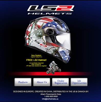
You may have noticed that in July of 2010, we published an entry about Allwin PowerSports Corp. coming out of their shell to distribute high-end LS2 motorcycle helmets in the US and Canada.

click to visit Allwin PowerSports
Well, their new helmet designs are ready to go and they are fantastic! Just take a look at the FF385 FT2 Liberty
design (image to the left).

Also ready is their warehousing and shipping operations in their corporate headquarters just outside of Chicago.

They've even shown off their products at the industry's trade show in February, 2011.

Along with all that activity, of course, is the work to be done to build out the website.  Allwin PowerSports has asked us to do this and we were delighted to comply.

When complete, the new website will sport full E-Commerce capability. Dealers will be able to view the entire LS2 Helmet product line, select the ones they want to carry in their stores, and purchase them online with their pre-authorized dealer accounts.

The general public will be able to view the helmets, but not see the pricing, since Allwin Motor Sports only sells wholesale, not retail.

If you're curious, the new line of  helmets has already been uploaded to the website, so go ahead and take a look. Let us know what you think!

For more information about Allwin PowerSports or the new LS2 Helmets, visit their website or contact Chun Liu at: 630-236-2366.

To learn what we can do for your company, contact us at:
UNETY Systems, Inc. 630-955-9500

Feb '11 Case Study: Website Design for Aspen Manufacturing Company

The Story Behind the Site


K.I.S.S.  - You've heard the expression, but sometimes it's easier said than done. That's pretty much sums it up for Aspen Manufacturing Company.

click to visit: http://www.aspensecondary.com
Aspen has been in the secondary manufacturing business for over 25 years.  Centrally located just outside of Chicago, they are a straight-forward, true-blue American company. They take fasteners, like a screws, nuts, and bolts, for example, and modify them to fit a particular purpose.

It's not rocket science, but Aspen Manufacturing Company fills an important need. They are good people. They know their customers, they know what they are doing, and they do it well.

So it's not surprising that they would want a simple, straight-forward website that just gets the job done. One that just says, "Hey, here we are, this is what we do, and here's how to get a quote." 

click to visit: http://www.aspensecondary.com
So, our challenge was to design a website for them that matched their company's approach, one that their customers would feel comfortable using.

We found the solution in another familiar saying, namely, "a picture is worth a thousand words." We decide to tell the story of what they do through crisp, professional photos of the parts that they work on. It took some effort to get these photos (you won't find them on google images), but it was worth the effort.

So, on Aspen's new website, you don't need to know a head from a shank or what a clevis pin is.  You can just look at the photo and, if it looks like what you need, click the large button for a quote. Or, better yet, call Aspen today. They'd love to talk to you in person!


Feel free to take a look at their website and let us know what you think!

For more information or to get a quote, visit their website at http://www.aspensecondary.com or give them a call at: 877-982-ASPEN (7736) | Office: 630-495-0922 | Fax: 630-495-0924.

To learn what we can do for your company, contact us at:
UNETY Systems, Inc. 630-955-9500


Jan '11 Case Study: Website Design for Tigerhill Studio

The Story Behind the Site

A New Year - A New Look, Finally!


One of our all-time favorite sites to work on, based on the stunning photographic images, is the website for Tigerhill Studio. This month, we were delighted to get a chance to take the site to a new level of both design and usability.

We had inherited the basic site design years ago and along with it, the masthead colors and layout. These had not been changed in many years and we had done our best to work within the existing framework.

Finally, this month, we were given a chance to do things "our way,"  as long as we did not go too crazy.

And here are the results:

  1. Hundreds of high-quality digital aerial and architectural photographs.
  2. Twelve themed photo/video  galleries, each more breathtaking than the previous one. 
  3. Over-image Previous and Next arrows for quick navigation
  4. Enlarged thumbnails at bottom for quick, intuitive navigation
  5. "Table top" image reflections on a black background
  6. Pencil line borders
  7. Automatic image captions and image names read from camera metadata
  8. Ken Burns style transitions
  9. Drop down menus on main screen
  10. Spry menu tabs and accordion controls on pop up windows
  11. Simplified navigation with less interesting utility pages converted to small pop ups.
All  the above features were designed with one purpose in mind: focus the visitor's attention on the photographs. Make the visit an experience. Make the site entertaining.

Did we achieve it? Why don't you be the judge!

Click here to visit Tigerhill Studio.com or contact John Hill by phone at: (708) 246-3566.


To learn what we can do for your company, contact us at:
UNETY Systems, Inc. 630-955-9500


Dec '10 Case Study: Website Design for Keyless Entry Locks


The Story Behind the Site


We are proud to announce...

In September of 2010, we re-designed an e-commerce website: www.KeylessEntryLocks.com and the results have been fantastic: sales have more than doubled since!

How did we do it?

This website has been ranked #1 in Google under our high priority keywords for the past 10-years so it gets a lot of visitors. But until we re-designed the website, we weren't converting our visitors into customers as effectively.

The new website has all the features you would expect in today's e-commerce websites, and then some like:
  • unlimited categories, products, options, sales
  • internationalshipping charges calculated in real-time with USPS, UPS and/or FedEx based on weight and destination address
  • multiple payment types (Visa, MasterCard, Discover, Am Ex, PayPal) 
  • integrated opt-in email marketing
  • special tools to show who's online, what they are viewing,  what's in their shopping cart, and how long they since they last clicked
  • WYSIWYG editing modes which make changing content a breeze, even for non-programmers
  • a handy "Featured Items" and a "Best Sellers" panel for soft suggestive selling
  • a "Quick Reorder" panel to encourage recurring revenue 
  • volume discounts for orders with multiple products 
  • banner ads
  • tax tables
  • address zones
  • moderated customer reviews and rating on individual products

What's our favorite new feature? 

Without a doubt, our favorite new feature is the "4 Easy Ways to Save Money" panel that shows on the main page. It's friendly, color, easy to understand, and really stands out! 

Best of all, the money-saving ideas it contains are a WIN/WIN. They explain ways that our customers can save money and so can we. Like big discounts for buying in volume or referring  friends and family. 


And the popular Bargain Bin points out the best deals of all -- almost new locks with full warranties and slight cosmetic blemishes.  So if you're planning on putting one of these locks on a gate or fence or even barn door, and want to save some money, this is a great way to go.


And don't forget the video!


The website has another new section: "Watch & Learn Quick Video Series" where we are uploading short videos demonstrating the things that people call and ask us about the most, like how to set the combination. It's hard to explain in writing, but once they see the video, they are good to go. These videos have reduced customer service costs and cut down the returns, so we are going to do more of them.


So, take a look and let us know what you think!

For more information about the KeylessEntryLocks.com or to purchase one of their locks, contact the Keyless Locks Store at Toll-Free: (866) 586-0131.


To learn what we can do for your company, contact us at:
UNETY Systems, Inc. 630-955-9500

Sep '10 Case Study: Website Design for the Green Earth Institute

Case Study:  The Story Behind the Site


Highlights:

The Green Earth Institute is a nonprofit organization established in 2002 to promote nutritional health and environmental sustainability.
click to view: http://www.greenearthinstitute.org

The Green Earth Institute runs an organic farm in south Naperville, which they use as a demonstration and learning center, and where they grow healthful vegetables in an earth-friendly way and educate the community about nature, nutrition, and caring for the earth.

This was a common case ...

As they grew in size over the years, the day-to-day effort involved in running their operation grew. Like many organizations, their website was not kept up to date.  They needed a website that would help them accommodate their growth in members and in programs. One that would make it easier to manage, not harder.

The requirements ...

  1. Simpler, easier-to-use site navigation
  2. Automated program and event registrations (i.e., on their website, instead of on paper forms)
  3. Automated payment collection and processing (i.e., with credit cards instead of just checks)
  4. Better and easier communications with their members (i.e., email instead of snail mail)
  5. Easier website content maintenance, so they would be able to keep the information up to date
  6. Many more photos of the farm, the staff, and the organic vegetables arranged in an interesting but not overwhelming way
  7. Much more member participation, through out the entire year, not just the growing season
  8. Better tie-ins to area events

And here' what we did ...


click to view: http://www.greenearthinstitute.org
First, we created a new graphical theme for their website, based on their name and original logo, but modified and updated for a fresh, new look. We selected descriptive tag lines, a lush, earthy color palette, comfortable fonts, and familiar image details that evoke the name Green Earth. You can see many of these concepts come to life in the masthead shown in the screen grab above.


To showcase their wonderful photos, we created a home page with a streaming Flash slideshow that accommodates any number of photos and starts playing instantly. It has friendly, VCR-like controls, full-screen zoom mode, and pop up thumbnails for quick, easy navigation.
 
To stream-line their registrations  and class sign-ups, we created a full powered shopping cart system with unlimited products, support for newsletter opt-ins, and can handle single or multiple payments by check or credit cards.  It even supports a credit card surcharge, to help keep costs down for members who are used to paying by check. We used 100% free, open source software to stay within their tight budget, both during and after the initial design phase.

click to visit: http://www.greenearthinstitute.org

To show the true scale of the organic farm and how it changes over the years from season to season, we arranged for our of clients, John Hill, of Tigerhill Studio, to donate something really special: aerial photographs of the farm at various times of the year. Because John has been taking photos of the Chicago area for over 30 years, he was able to provide some current shots as well as some fascinating historical ones. These incredible aerial shots are included in the slideshow on the main page.


So, take a look and let us know what you think!

For more information about the Green Earth Institute or their organic vegetable farm shares, visit their website or contact their founder, Steve Tiwald at: 630-664-5681.

To learn what we can do for your company, contact us at:
UNETY Systems, Inc. 630-955-9500


Jul '10 Case Study: Website Design for Allwin Powersports

The Story Behind the Site


click to view: http://www.allwinmoto.com/
We've just released a very cool website to distribute LS2 Helmets in North America. The reaction we're hearing: WOW!

Highlights:

1. This was a rare case ...

We got to start from scratch... well, almost.
Our client, Allwin Powersports, was just starting up a business in Illinois to distribute a brand new line of motorcycle helmets designed in Europe, created in China. They planned to distribute these helmets exclusively in North America.
That meant no legacy to deal with, no problems to overcome. How fun is that!

2. The requirements ...

The new line of helmets was not yet ready, so the requirements we got were fairly short. Just:
  1. tell the story of Allwin Powersports (who they are, really)
  2. show off the new product line
  3. provide a way for dealers to sign up.
Sounds simple, right? Oh, yes, and do it in a week or two—the first magazine ads were already being printed.

3. The reality...

As easy as all that sounds, the reality was just a little different, once we took a closer look:
  1. No product meant no photos, so showing off the product was going to be a challenge.
  2. Dealer sign ups meant capturing dealer contact information and email addresses in a database so that they could be fed into the email marketing campaign messages.
  3. Email marketing campaigns meant providing a way let dealers pre-order product for a certain length of time at a percentage discount.

4. That meant we needed a website:

  • with an opt-in/opt-out email newsletter
  • that integrated with a shopping cart
  • which had the ability to display product photos, prices, and details
  • which could calculate sales tax for the appropriate state, based on shipping address
  • which could calculate shipping rates
  • which could accept credit cards, PO's, and check payments
  • which could handle back orders
  • and which could schedule special sale discounts for a given time span

5. So here's what we did...

  1. As soon as the first helmet arrived in the States, the client took some photos of it with a point-and-shoot camera on a brown cardboard box outside in the daylight.


  2. click to view: www.allwinmoto.com/


  3. We photoshopped out the background, cleaned up the reflections, and sharpened the edges.
  4. We then built a prototype design for the main page of the website that built upon the concepts in the existing ad campaign, i.e., that idea that the helmet and indeed the client's firm was "coming out of it's shell". This meant that people who saw the ad and came to the site would recognize the brand image
  5. This cut down significantly on design time and let us get onto development much sooner.
  6. We selected an open source shopping cart that had all the features required and added the custom modifications.
  7. We published the new site several days a head of schedule.
So, take a look and let us know what you think!
For more information about Allwin Powersports or the new LS2 Helmets, visit their website or contact Chun Liu at: 630-236-2366.
To learn what we can do for your company, contact us at:
UNETY Systems, Inc. 630-955-9500

Click to see our packages and pricing for hosting, email, domain names, etc.

May '10 Case Study: Website Design for BMI Surgery

The Story Behind the Site


Click to view: www.bmisurgery.org/
We've released a fabulous new website for BMI Surgery in Joliet, IL and it is getting wonderful reviews from the doctors, staff, and patients.

Highlights:

1. Dramatically improved "look":

  • more appropriate color scheme ("surgical" blue)
  • more relevant images
  • appealing and appropriate animations
  • consistent fonts, colors, styles, headings, footer, etc. across the site

2. Greatly simplified navigation:

  • know where you are at all times
  • go where you want in 1 or 2 clicks
  • know where you will land BEFORE you jump
  • find what you are looking for quickly & easily

3. Whole new, patient-centered branding:

  • changed from presenting facts about the medical practise to providing information for the patients, e.g.,their questions & concerns.
  • Animated theme:


    • It's about YOU ...
    • It's about your HEALTH ...
    • It's about your FAMILY ...
    • It's about your LIFE!

4. Social media marketing designed in from the start

  • to allow patients to spread the word, make referrals, act as an example
  • to increase advertising effectiveness and simultaneously reduce costs
  • to tap into current nationwide trend for more effective weight loss programs
  • to provide community support and entertainment value as patients lose weight

5. Upgraded technology:

  • video
  • animations
  • flash
  • SSL
  • e-commerce
  • patient newsletters
  • email campaigns
  • & more

For more information about BMI Surgery, visit their website or contact Vicki Funk, BMI Surgery, (815) 723-8571.
To learn what we can do for your company, contact us at:
UNETY Systems, Inc. 630-955-9500


Click to see our packages and pricing for hosting, email, domain names, etc.

Mar '10 Case Study: Website Design for Tigerhill Studio

The Story Behind the Site


Highlights:


Great photography can be truly breathtaking! Especially if the view is unusual—like from up in the clouds looking down over the city lights of Chicago.
But how to make it work on the Web? There were a few problems, or, shall we say, challenges?

The challenges ...

  • Our client, Tigerhill Studio, has been taking aerial and architectural photos for over 30 years! How can we showcase the depth and breath of their 10,000+ images without being overwhelming?
  • And, can we use the images to gain regular, recurring "face time" so that customers will think of Tigerhill when they need custom aerial and architectural shots?
  • And, can we create a buzz on Facebook, Twitter, and other social networking sites to extend our reach to the people who are most likely to buy?
  • And, can we increase sales of commercial real estate photos during a time when sales have been almost non-existent?

Our approach ...

First, let's be realistic, Tigerhill's photos look much better large. They are shot with incredible cameras, image stabilizers, and at amazingly high resolutions. So, the details are there where you zoom in.
Dare we build a website large enough to really show them off? If so, can we make the photos load quickly?
We did a little research into the client base and found that many of them access the Web from notebook or laptop computers, which typically have high resolution screens. So, a larger website page that would fill up their screen was actually a great idea.
Next, we checked into their connection speeds. Most had dedicated connections or high speed cable. With image compression features available today, we could build a large page, with big images that loaded quickly, as long as we loaded one image at a time.
But how would viewers navigate through these images? Solution: build a series of thematic slide shows, each with thumbnail previews of the images inside. And do it in Flash with VCR-type controls for automatic image advance, easy maintenance, great compression, and overall accessibility through the free Flash Plugins.

The results ...

Customers tell us they like the site so much they've make it their home page—they just LOVE looking at the pictures.
Actually, we can't really blame them, we do, too!
In fact, we are about to start offering Windows Wallpapers, so you will soon be able to see a slide show of your favorite images, right on your computer's desktop.
It's just one more way we can keep John Hill out there in front of his clients!

Jan '10 Case Study: Website Design for iButton Locks

The Story Behind the Site


If you want to sell online, take a look at our iButton Locks site. It’s a full-featured shopping cart site that is easy-to-maintain, reliable, and secure. It will show you what’s it takes to have a successful Web-based sales engine.

Highlights:

Click to visit: http://www.ibutton-locks-online.com/

A great new product, but it needed some explanation

When the Keyless Lock Store decided to sell a completely new line of keyless locks, they needed a new strategy.
Since many of the keyless lock features would be unfamiliar to most of their customers, more description and imageswould be needed to educate people about this new line.
This meant we could not just add the new locks to an existing website along side lots of other locks. There just would not be enough room to do what was needed.

Put the spot light the product & keep it there!

A better approach would be to brand new, website—just for this product line—so we could really focus on presenting the product clearly and attractively.  This approach meant a lot more information up front about the new product to help the customer come to a "buy" decision.
This approach would also give customers an simpler set of choices (the famous more is less approach) and at the same time make search engine optimization easier (keywords, metatags, reciprocal links, etc) easier and less expensive.
Clearly, we needed a shopping cart application that was quick and inexpensive to develop, worked reliably, was loaded with all the bells and whistles. But we also needed one that could be customized with the new product brand. That meant an open source shopping cart application.

Don't start from scratch ...

Shopping carts are complex software applications and can be quite expensive. But fortunately, they are so commonly used that there are now many applications available. So we recommeded a buy-it-don't-build-it approach. Ok, but which one?
Clearly, we needed open-source, template-based shopping cart that could accommodate the handful of extra pages in the early part of the process flow would be ideal.  But, there were hundreds of shopping cart applications available and each claimed to be best.
Click to visit: http://www.ibutton-locks-online.com/

Pick a good one ...

Here are a few of the steps we followed to make our recommendation:
  • Contacted other webmasters with storefronts that looked good

  • Looked up shopping cart applications supported by credit card processors and fulfillment houses

  • Ssearched vendors' websites for packages, pricing, feature listings

  • Checked user forums, tech support
  • Read reviews, blogs, postings in user communities

  • Downloadied trial versions

    And, finally, worked up prototypes to make a final selection.


The results? 

Take a look for yourself and let us know what you think.
For more information about iButton Locks, visit their website or contact them at: 866-561-1476.
To learn what we can do for your company, contact us at:
UNETY Systems, Inc. 630-955-9500


Click to see our packages and pricing for hosting, email, domain names, etc.

Oct '09 Case Study: Website Design for More is Expected

The Story Behind the Site


These days, you don't have to be rich or famous to write, publish, and sell your own book, if you know how to use the power of the Internet. Bill Reamer is living proof. Bill's company CED Gateway, was a long-time client of UNETY's and Bill was our main contact there, so we knew each other well. What a delight it was to hear he had written a book! Who KNEW he was an aspiring writer! So when Bill approached us to market and sell his book online, it was a special treat.

What was needed ...

At the onset of the project, Bill had already written his book—he already had softcover books ready to be shipped.
So, the goals were fairly simple (somehow, it always seems that way at the start), just:
  1. provide a way to take orders and
  2. find an inexpensive way to market the book
Digging in a little, a few more things were needed to make our client a success. The new site had to allow Bill to:
  1. update the content daily, if he needed to
  2. send out email flyers and newsletters to hundreds or thousands of recipients
  3. manage his own order fulfillment
  4. handle credit card payments as inexpensively as possible
  5. add new products from time to time—an epic poem was apperenly in the works
And for Bill's customers, the new site had to:
  1. provide a full-blown shopping cart where they could securely login, learn about Bill's book, and purchase as many copies as they wanted
  2. accept all major credit cards and PayPal,
  3. be Payment Card Industry (PCI) compliant,
  4. show the status of each customer's orders,
  5. allow different shipping and billing addresses,
  6. charge sales tax in Bill's home state of KY, but no where else,
  7. handle international shipping,
  8. show shipping charges accurately and in advance of order placement,
  9. let visitors read and write their own reviews,
  10. let visitors recommend Bill's book to their friends.